
Spotify Artist Catalogue Manager
Services: UX Research, UI Design, App Development

Project
Founded in 2006, Spotify is a leading digital music service with 113 million subscribers, connecting people to music worldwide. While it’s the top choice for listeners, artists have limited control over their content. Our project, the Spotify Artist Catalogue Manager, aims to enhance the artist experience by providing greater control and personalized features for music creation.
As the UX Researcher on a four-person UX team, I worked on this project during the Winter term (Jan–April 2020). Initially planned as an in-person experience, it shifted to a remote project due to the COVID-19 outbreak and related restrictions.
Objectives
-
Design a Mac-based editor and artist management system that enables artists to manage their presence on Spotify. The solution must incorporate all existing artist content while allowing flexibility to add features that enhance the artist experience.
-
Ensure compatibility with macOS constraints, as the solution must function as a Mac desktop app and operate within the platform’s system capabilities.
My Role
As a UX Researcher, I led user research and concept development. During the initial research phase, I conducted a comparative analysis of digital music platforms and assisted in recruiting potential users. I also synthesized qualitative data into key research findings and actionable insights.
In the define and ideation phases, I collaborated with the team to create personas, empathy maps, and journey maps while refining the problem statement. Additionally, I conducted research as needed beyond the initial research and planning phases.
During the evaluation phase, I worked the UX research report, analyzed usability testing data, and provided both qualitative and quantitative insights on key findings.
Design Process

Discovery Define Ideation Prototype Test
Design Solution
We started our project by drafting a team contract that defined the team norms and work ethics. The contract helped us create a framework to define our team goals and deliverables and set timeline for the whole project.
With our user research we learnt Spotify doesn’t offer much flexibility to artists to manage their catalogues, they also don’t have any way to increase their online presence using the streaming platform. Our solution proposed a user experience that enabled artists to manage their music catalogues. This user-centered experience provides advanced analytics tool, channels, podcasts, online store to sell their merch and real-time interactive streaming service that enhance the relationship between artists and their fanbase.
Research
UX Research lays foundation of the design decisions and helps you understand your user needs. For this project we have tried to use a combination of qualitative research methods that includes competitor analysis, surveys, field study, ethnographic interviews, thematic analysis, heuristic analysis, observations and usability testing.
User Interviews
To build empathy with our users we conducted semi-structured interviews with artists from the local community to understand their motivations, pain points and experience with digital music streaming service in general. Our users fell into three different focus groups – full-time musician, part-time artist and an upcoming musician, and ranged between the ages of 23 to 40, we selected them based on our screener. Before interviews, we worked on questions and decided to divide them into three main categories: Experience Focus, Revenue Focus and Spotify Focus.

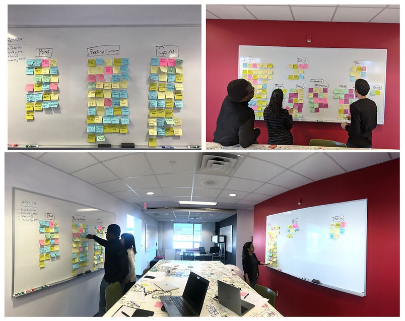
Empathy Mapping
We synthesized data gathered during interviews to work on empathy map for each of our user. Conducting that session helped us in elaborating on our user personas and provided shared understanding of user needs.
After familiarizing ourselves with the data, we used pain points collected from empathy maps to work on thematic analysis of our users. We noticed some common themes between our users and collated all the data into groups and categorized the information gathered.
Insights
People do not recognize music as a full-time profession.
Artists are compensated poorly on digital music platforms.
There's a corporate monopoly and music companies rob artists of their due share.
Many artists have limited technical knowledge and often encounter problems while uploading and editing music.
Lack of technical knowledge restricts artists to work on their online presence.
Ideation
We used affinity mapping to organize user pain points into different themes which helped us to prepare data to build user personas.

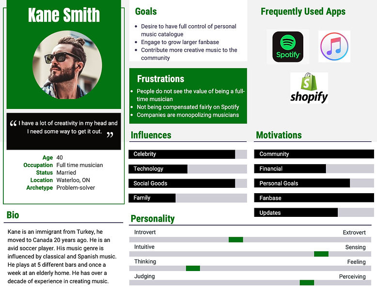
Personas
Using research and insights collected from building empathy maps with our target users we build personas to define them. The personas we build incorporated the needs, goals, and observed behavior patterns of our target audience.
Journey Map
We created user experience for tech-savvy and novice internet users to understand their touch points and satisfaction when interacting with artist catalogue manager both as first time and as returning users. Journey map is an excellent tool for UX designers because it visualizes how a user interacts with a product and allows designers to see a product from the perspective of an end user.

User quotes
“Music is an expression”
“Promotion is worth every penny”
“I have a lot of creativity in my head and I need some way to get it out”
“Everything I have is stored locally”
“Always do something you love”
“It is one the hardest jobs. Everybody looks at music as a hobby”
“Music is good for your soul”
Story Mapping
We did a story mapping workshop for backlog visualization of our findings and redefining our problem statement. Story mapping helped us to tell a story of how artists could interact with each functionality within the new workflow and enabled team to refine solution and helped with planning for the development phase.

Catalogue
The easy-to-use catalogue gives complete control to the artists. It offers flexibility to upload music, run customization, showcase personal brand and make edits.

Analytics
Our advanced analytics tool gives 360 view to analyze wide range of data. Besides, it gives revenue details about trending product(s), service, merch, music at any specific time.

Online Store
The online store becomes a one-stop shop to buy and sell merch and build strong relation with the fanbase.

Livestream
Live streaming lets artists create and share videos in real time. The option gives artists an opportunity to reach and interact with fans across the world.

Channels
Channels section gives wider flexibility to an artist to engage with their fans through live chats, podcasts and live streams.

Reflection
This was my first real UX project and I was both excited and nervous. Previously I have had an experience with design and research but didn't really know about the user experience in real. I took the project as a challenge and learnt a lot about UX and UI throughout the process. I have been a huge fan of Spotify and it was unreal in the beginning that there might be some shortcomings in their near perfect design architecture. But once I built empathy with our target users, it became easier to understand their pain points and frustrations.
Also, since this project was part in-person and part remote due to pandemic lockdown it required a lot of adjustments, time management and discipline.
Spotify is one of the leading music streaming service providers, bringing in a solution to something as big was not easy. I feel very proud of our solution and the powerful corporate prototype we created which has a huge potential and look forward to the prospects of sharing it with Spotify in future.
User Flow
The user flow highlights all the possible paths an artist might take during the process of managing their catalogues.
Information Architecture
We used Miro to create information architecture which helped us understand the structure of design and organize content and different functionalities.

Wireframes
Low-Fidelity
A screenshot of our lo-fi wireframes

Medium Fidelity Prototype
A screenshot of mid-fi prototype, we invited same users we interviewed earlier during the discovery phase for remote usability testing.

Usability Testing
Remote Moderated Usability Testing
Once we had our medium-fidelity prototype ready, we invited our target users to conduct remote usability testing. Three tests were conducted consecutively for two days that enabled us to understand user's behaviour from the perspective of a first-time user to a returning user.
We used 10 different scenarios and assigned time for each task. The estimated overall time for the test was 45 minutes followed by a 15-minute interview and feedback session.
There was a moderator and an observer, we used Zoom to facilitate these sessions. Users were provided with a test doc that has a list of tasks and time allotted for each activity. They were told to share the screens and think out loud so we could take notes of their thinking process.
Areas of improvement
-
Some words we used on prototype were not consistent with the task description.
-
Users were not clear about VOD (Video On Demand) section.
-
Navigation needed to be worked on.
-
The order of the tasks we gave them was not in hierarchal order as the prototype and posed challenge(s) for our users.
-
Some of our instructions were not clear for novice internet users.
Iteration
Based on the results from user feedback we made changes before the second round of usability testing. We simplified the user flow to complete each task. After changes, we got a higher satisfaction rate and 100% recommendation rate from all of our users. We noticed users felt more confident as their initial hesitation was gone and they felt comfortable using different functionalities.
Stakeholder
University of Waterloo
Year
2020
Methods
Information Architecture
Interviews
Journey Maps
Personas
Thematic Analysis
User Flow
Prototype
Tools
Figma
Miro
Whiteboard
Pen & Pencil